Inspired by a rather useful blog by the venerable Pat Walters on how to make pretty scatter plots using seaborn. I thought it would be useful to me to document how I could do this in Julia using Algebra of Graphics. What particular appeals to me about this package is how quickly it can construct beautiful (and complex) figures.
We will use the same data Pat used. First import the modules and tweak the theme.
using AlgebraOfGraphics, CairoMakie
using DataFrames
using CSV
update_theme!(
fontsize=16,
markersize=8,
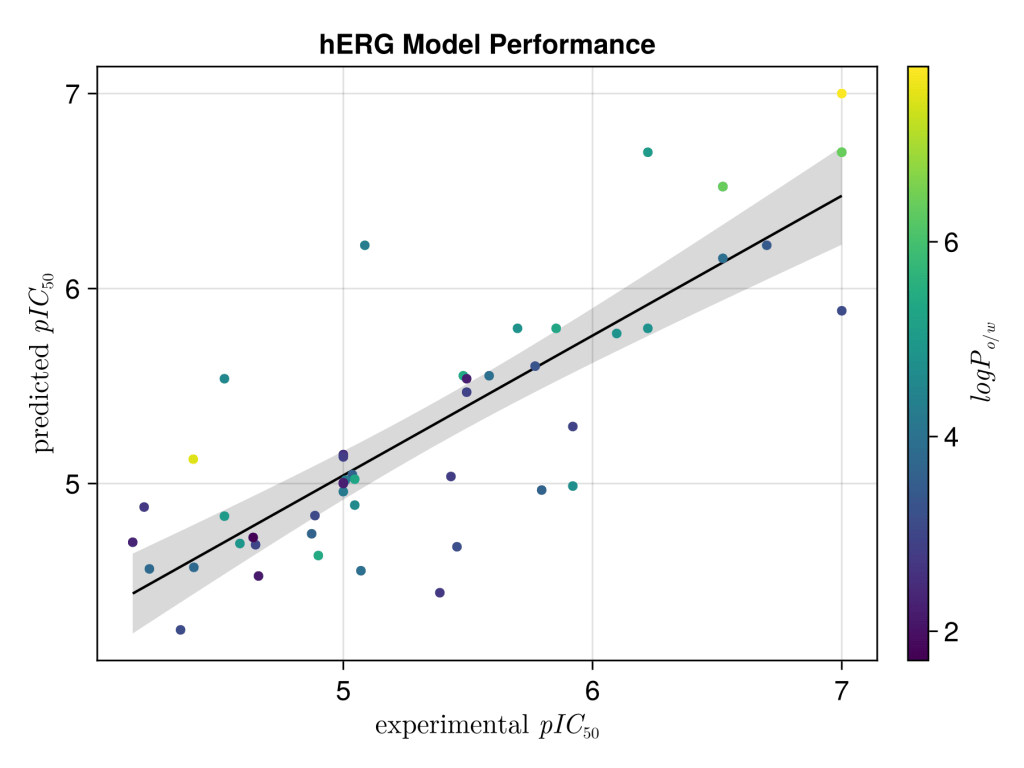
Axis=(title="hERG Model Performance",))Next, we will read in the data, and extract out the logP, experimental and calculated IC50 values. It’s much better to work in pIC50 values so we convert these (it also makes plotting massively easier). A few things to quicker note for those are new to Julia; i) μ is just inputed as \mu ii) The .* 1e-6 is multiplying every element in the list “x” by 1e-6, similarly for -log10 function. iii) Julia uses quotes use ” ” rather than ‘ ‘ for stings.
df = CSV.read("seaborn_scatterplot_example.csv", DataFrame)
expt_IC50_μM = df[!, "Experimental IC50(uM)"]
predicted_IC50_μM = df[!, "Predicted IC50(uM)"]
logP = df[!,"LogP"]

function convert_pI50(x)
    _IC50_M = x .* 1e-6
    return -log10.(_IC50_M)
end

x = convert_pI50(expt_IC50_μM)
y = convert_pI50(predicted_IC50_μM)
It would be more elegant to use the input data frame and modify it in the mapping step, but I think this is harder to read. So we reassign the data frame with just what we want to plot. After some renaming of the x and y axis using LaTeX. We then compute a linear fit of y ~ 1 + x , and combine this with the scatter plot. The result is a very clean plot with minimal coding.
#take replace the dataframe with the modifed data
df = (; x, y, logP)
xy = data(df) * mapping(:x => L"experimental $pIC_{50}$", :y => L"predicted $pIC_{50}$", color=:logP => L"$logP_{o/w}$")
layers = linear() + visual(Scatter)
fg = draw(layers * xy)

save("figure.png", fg, px_per_unit = 3) 